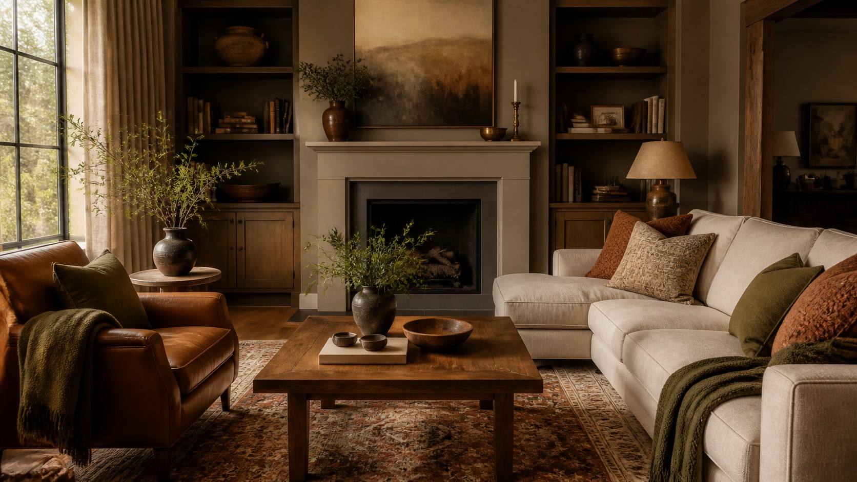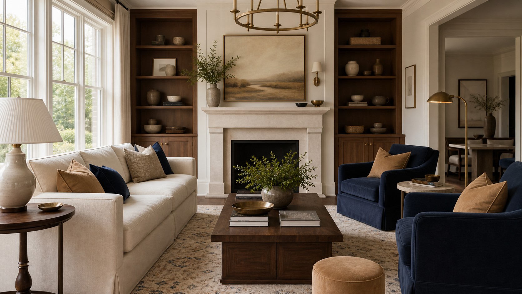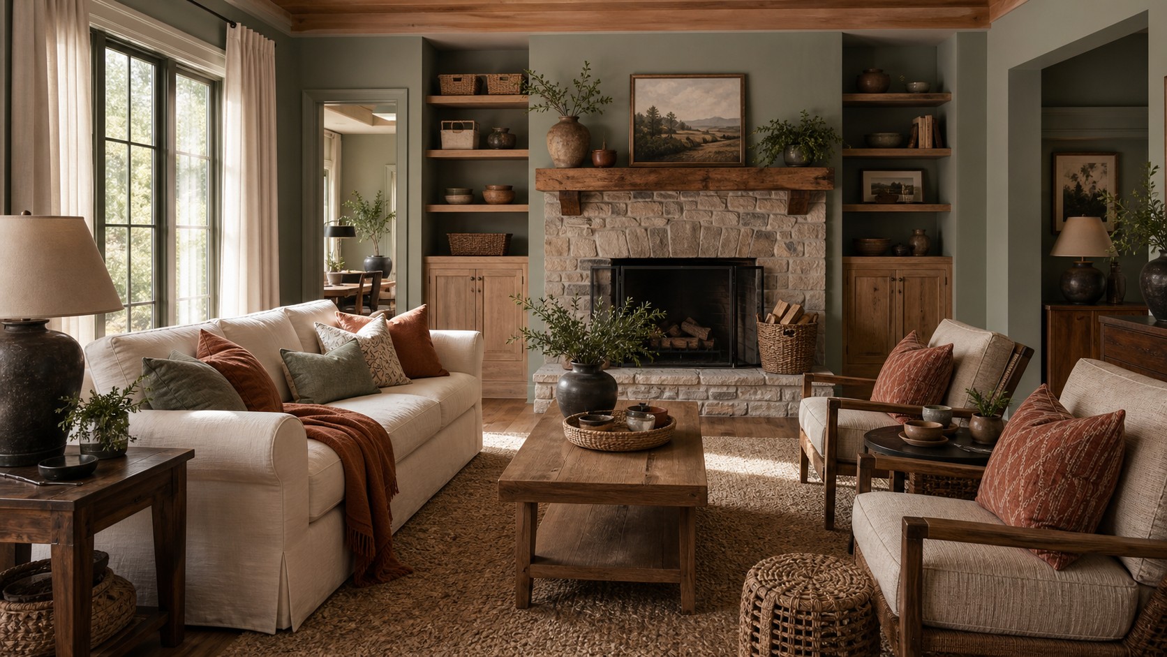
The perfect family room palette is not a universal set of paint chips. It is the combination that makes your room’s fixed materials look intentional, supports the mood you want, and remains pleasant under the light you actually have. Choosing it becomes much easier when color decisions follow a sequence. Start with floors, stone, wood, and large furnishings that will stay. Study daylight and evening conditions. Define a few emotional words, then build a hierarchy of background, supporting, and accent tones. This process replaces guesswork with observation while leaving room for personality, ensuring the finished room feels cohesive rather than cautiously matched.
A: Three to five usually works best: one main color, one or two supporting colors, and one or two accents.
A: Either works, but contrast helps the furniture stand out and keeps the room from feeling flat.
A: Warm white, greige, soft taupe, and light beige are flexible choices for most homes.
A: Yes. Use bold color on one feature wall, built-ins, furniture, or accents instead of everywhere.
A: Identify the undertones in your sofa, rug, and floors, then choose paint that complements them.
A: It should coordinate, especially in open layouts, but it does not need to be identical.
A: Warm neutrals, olive, terracotta, camel, chocolate, deep blue, and muted green all add coziness.
A: Soft whites, pale greige, light blue, warm beige, and muted pastels can make the space feel more open.
A: Test large samples in different lighting and compare them with your furniture before buying gallons.
A: Keep walls neutral and use pillows, throws, art, and decor for easy-to-change color.
Begin with what is already decided
Every family room has a palette before paint enters the conversation. Flooring may contribute honey oak, cool gray tile, red brick, or creamy stone. A fireplace, built-in cabinetry, sectional, or favorite rug may add other nonnegotiable tones. Photograph and list these elements, noting which cover the most visual area. Large fixed surfaces exert more influence than a small accessory, so they should lead the color process even if they are not the most exciting part.
Identify the undertone of each fixed item. Compare it with clearly warm and cool samples rather than judging it alone. Gray may lean blue, green, violet, or brown. Beige may lean yellow, pink, or gray. Wood can carry orange, red, greenish, or neutral brown notes. You do not need every undertone to match, but they should form a plausible family. A bridging neutral can often connect two fixed materials that differ slightly.
Describe the mood before naming colors
Choose three words for how the room should feel. Calm, bright, grounded, cheerful, tailored, airy, intimate, and energetic each imply different color behavior. A calm room may use neighboring values and softened hues. A tailored room may need stronger dark-light contrast. An intimate room can support deeper walls and warm midtones. Emotional language is more useful at first than deciding the room must be blue or beige.
Consider household habits as part of mood. A family room used for morning play and homework may benefit from more brightness than one used for evening films. Frequent entertaining may call for a balanced palette that flatters people in varied light. If the room opens to a busy kitchen, visual calm may be especially valuable. The desired atmosphere should respond to real routines, not an isolated inspiration image.
Read the natural light accurately
Window direction shapes color throughout the day. Northern light is cooler and steadier, often emphasizing blue and gray undertones. Southern light is warmer and stronger, allowing cooler colors to remain welcoming. Eastern rooms receive warm morning light and become cooler later. Western rooms may look muted in the morning and intensely golden at sunset. Trees, neighboring buildings, roof overhangs, and window treatments can alter these general patterns.
Observe the room at several times and note when it is most often occupied. White paper can help reveal whether daylight appears blue, green, or warm beside the window. Do not choose paint under store lighting or from a phone screen. The same color may look restrained in a bright showroom and surprisingly saturated at home. Natural light is an active ingredient in the palette, not merely illumination applied afterward.
Find a useful starting piece
A multicolor rug, artwork, patterned textile, or stone slab can provide a tested group of compatible hues. Choose a starting piece you genuinely like and expect to keep. Pull the quietest color for broad surfaces, one midtone for upholstery or curtains, and a smaller lively note for accents. You do not need to reproduce every color. The object is a guide, not a contract.
If the room has no patterned starting piece, begin with the largest fixed finish and build outward. A warm oak floor may suggest cream, olive, muted blue, and charcoal. Cool gray stone may support mushroom, blue-green, soft white, and dark bronze. Collect physical samples and place them together. A successful palette reads as a group before any single color is applied to a wall.
Build a five-part palette
A practical family room palette can be organized into five roles: a light neutral, a midtone neutral, a main color, a dark anchor, and a small accent. Not every role needs equal presence. Warm white might cover walls, taupe may appear on the sofa, olive could define chairs, walnut or charcoal can anchor furniture, and rust may enliven pillows. The roles help maintain hierarchy as shopping decisions multiply.
Some rooms merge roles. Medium wood may function as both the midtone and dark anchor, or a deep blue wall may serve as main color and grounding note. That flexibility is useful. The purpose is to make sure the scheme includes enough range. If every selection is pale, the room may appear washed out. If every choice is medium-dark, it may feel heavy. A complete value structure makes color easier to distribute.
Choose the right neutral family
Neutral is not the absence of color. Warm whites, creams, beiges, taupes, greiges, mushrooms, and soft grays each carry undertones that interact with fixed materials. Start by deciding whether the room needs a warm, cool, or balanced neutral family. Warm wood and brick often welcome cream, putty, or complex taupe. Cool stone may favor greige, mushroom, or a softened gray, though warm textiles can still prevent chill.
Compare neutrals directly against trim, ceiling, flooring, and upholstery. A new warm white may make existing white trim appear blue or dirty. In that case, repainting both may be worth considering, or choose a wall color that intentionally contrasts. Avoid selecting the lightest chip automatically. Slightly deeper neutrals often have more identity and can make trim, art, and furniture look sharper.
Select a main color with a long view
Your main color should support the desired mood and connect to something already present. Blues and greens are popular because they pair easily with natural materials, but clay, burgundy, ochre, and plum can also be lasting when softened. Review colors you consistently wear, save, and use in other parts of the home. Repeated personal preference is a better predictor of longevity than current popularity.
Decide how much commitment suits your confidence. A beloved color can cover walls, cabinetry, or a major sofa. A newer interest may belong on chairs, curtains, or a rug first. More area makes any hue appear stronger, so large applications often require a grayer or quieter version than expected. Color intensity should also reflect light: a dim room may need richness, but very saturated paint can become overpowering without adequate illumination.
Add a dark anchor
Many palettes feel incomplete because they lack a confident dark value. Charcoal, espresso, walnut, navy, forest green, blackened bronze, or deep burgundy can define edges and prevent pale colors from floating. The anchor might appear in a media console, lamp, fireplace, table, or rug pattern. Repeat it at least twice so it belongs to the composition.
The dark note does not need to be black. Choose one that relates to the fixed finishes and main color. Walnut may be more harmonious than black with warm oak, while charcoal can connect cool stone to blue upholstery. Keep the darkest elements distributed across the room rather than concentrated on one wall. Balanced placement helps the eye travel and makes the scheme feel stable.
Use accent color as punctuation
An accent should energize the palette without fragmenting it. Select a color that complements the main hue or appears in the starting rug or artwork. Rust warms blue, dusty rose softens green, ochre brightens charcoal, and muted teal enriches camel. Use the accent in a few noticeable locations at different heights. Pillows, a throw, artwork, flowers, and a small lamp are ideal.
Resist buying every attractive accessory in a new color. Isolated accents create visual noise and weaken the core palette. When a new hue enters, either repeat it intentionally or let it remain part of a multicolor artwork where it does not require an exact echo. Accents are also the easiest layer to change, so they can respond to seasons while the larger color structure stays steady.
Consider texture and sheen
Color cannot be separated from material. Velvet makes a hue look deep and luminous, linen makes it dry and relaxed, leather adds warm variation, and ceramic may introduce reflection. A palette with limited color can still feel rich when each tone appears through several textures. Conversely, many colors in similar smooth finishes can look flat and busy at once.
Sheen changes both appearance and practicality. Matte walls absorb light and disguise some imperfections, while satin trim reflects it and outlines architecture. Glossy surfaces intensify color and draw attention. Use sheen to establish hierarchy: quiet broad surfaces, slightly livelier durable trim, and small reflective highlights in metal or glaze. View samples at the intended angle because horizontal and vertical surfaces catch light differently.
Distribute color around the room
Once the palette is chosen, map where each color will appear. Avoid placing all dark tones low, all color on one side, or every patterned object together. Repeat the main and anchor colors across the room at varied heights. A green chair may relate to artwork above the sofa and a small object on a shelf. Walnut tables can connect to frames and a cabinet across the room.
Color distribution should support the focal point. A fireplace may deserve stronger contrast, while a television wall may benefit from reduced contrast so the screen recedes. Consider views into and out of the room. An accent visible from the hall can invite entry, and a related note in the adjacent kitchen can connect spaces. Balanced repetition is more important than exact symmetry.
Sample at realistic scale
Tiny chips are useful for narrowing options, not making final decisions. Paint large boards with two coats and leave a border so neighboring wall color does not contaminate the sample. Move the boards to every wall and view them beside the floor, sofa, fireplace, and curtains. For dark colors, larger samples are especially important because area greatly changes perceived intensity.
Order upholstery and curtain samples as large as possible. Fold them to see shadow, hold them vertically, and place them near likely neighboring materials. Test rug samples on the floor, where light strikes differently. Keep the full sample set visible for several days. If one element only works at noon or requires explaining away an undertone, it is probably not the right choice.
Check the evening palette
Family rooms often receive more use after sunset than during ideal daylight. Turn on the actual lamps and overhead fixtures while evaluating samples. Warm bulbs may intensify cream, red, and wood while muting blue and green. Poor color rendering can make nuanced paint and fabric look dull. Upgrade inconsistent bulbs before rejecting a palette that worked during the day.
Plan enough light sources to reveal the chosen colors. Dark corners can make medium tones read heavier, while a shaded lamp can bring warmth to a deep wall. Keep bulb temperatures consistent within visible areas and use dimmers to adjust brightness. The evening version of the palette should feel intentional, not like a diminished copy of the daytime room.
Refine through subtraction
After the major pieces are installed, pause before filling every surface. Remove accessories that introduce unrelated colors and group the remaining items by palette role. The room may need less accent color than expected because books, plants, and personal objects already add variation. Add only where the composition lacks balance, warmth, or a useful point of focus.
The perfect family room palette is the one that survives real observation. It honors fixed finishes, responds to light, expresses a chosen mood, and gives each color a distinct job. By building from physical samples and distributing tones deliberately, you avoid a string of isolated decisions. The room can still evolve, but its foundation remains coherent. That balance of structure and flexibility is what makes color feel personal, livable, and complete.