Color schemes last when they are rooted in relationships that repeatedly feel good: light against dark, warm against cool, quiet fields against smaller moments of intensity. Timeless does not mean colorless, nor does it require choosing the safest beige available. Navy, green, red, blue, brown, and even black have long histories in welcoming rooms. Their staying power depends on selecting nuanced versions, using them in sensible proportions, and connecting them to natural materials. A flexible scheme gives large surfaces a steady role while allowing pillows, art, and smaller furnishings to shift as the room and its occupants change.
A: Warm neutrals with natural wood, black accents, and soft texture are among the safest timeless choices.
A: Yes, but warmer grays and greige tones feel more current and lasting than cold blue-gray shades.
A: Cream, camel, taupe, olive, chocolate brown, muted rust, and warm wood tones create a cozy feeling.
A: Cream, beige, camel, charcoal, navy, olive, or brown sofas are flexible and long-lasting.
A: Usually yes for an open feel, but darker walls can work beautifully with lighter upholstery and good lighting.
A: Use pillows, throws, rugs, curtains, lamps, books, artwork, and decorative bowls.
A: Cream, sage, navy, taupe, warm white, charcoal, muted blue, and olive pair well with most wood tones.
A: Yes, if you add wood, woven textures, soft upholstery, warm lighting, and off-white tones.
A: Soft white, warm beige, pale greige, muted blue, and light wood help small spaces feel larger.
A: Three main colors plus one or two small accents usually creates a balanced, timeless look.
The qualities of an enduring scheme
A lasting palette usually includes a versatile background, a grounding tone, and at least one color with emotional character. It also responds to the home’s architecture and permanent finishes. Warm stone, orange-toned wood, and cool concrete each suggest different companions. Ignoring those elements can make even a classic combination feel wrong. Begin with what cannot easily change, then choose colors that clarify rather than fight those undertones.
Timeless schemes are rarely built from pure colors. Off-white is easier to layer than brilliant white, grayed blue is calmer than primary blue, and oxblood often integrates better than bright red. Complexity allows a color to change gently across daylight and lamplight. It also helps materials from different periods coexist. When the palette includes a range of values and textures, it can remain recognizable while individual pieces are updated.
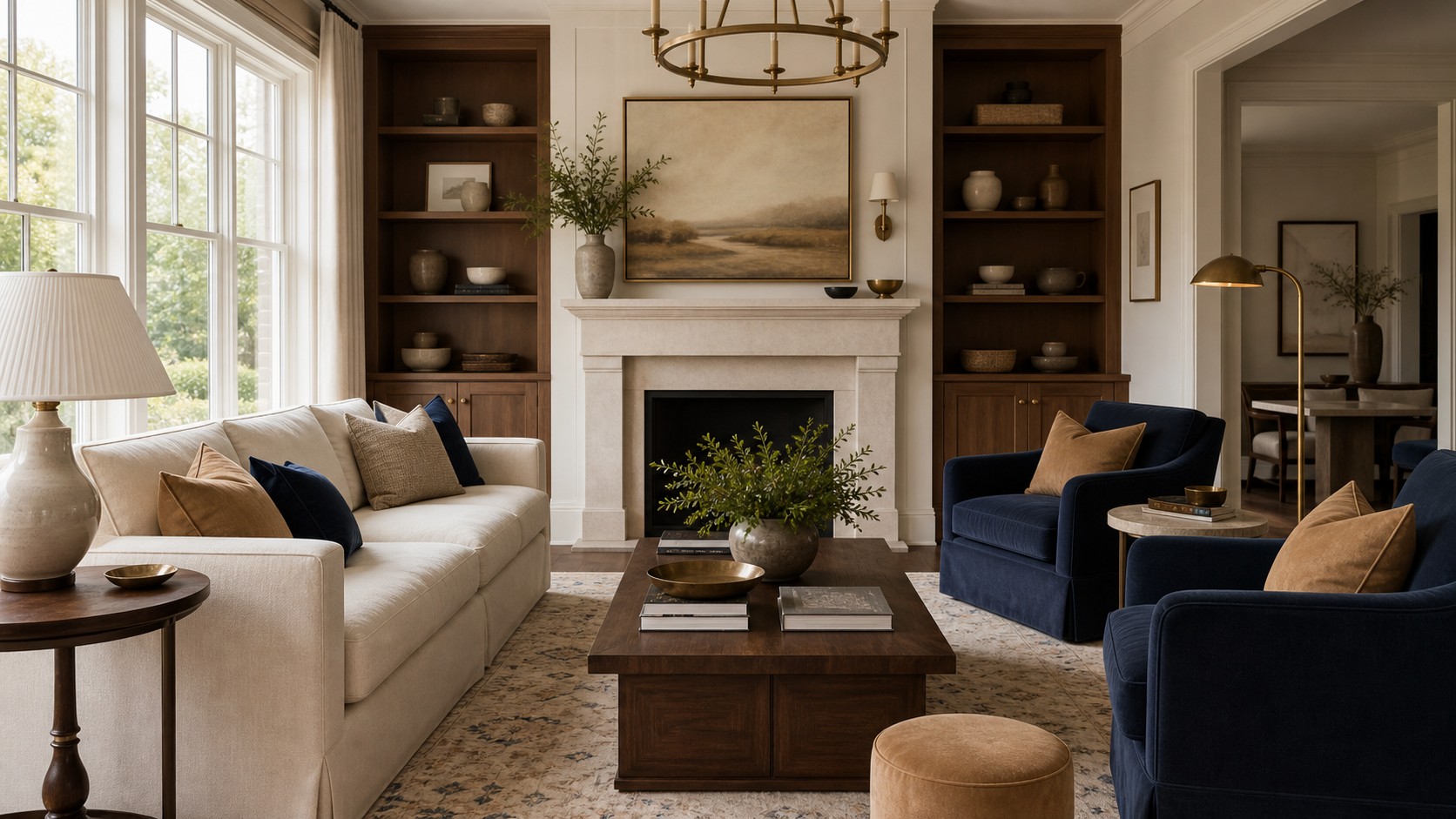
Ivory, navy, camel, and walnut
This combination endures because it balances crispness and warmth. Ivory provides generous light, navy contributes depth and tradition, camel softens the contrast, and walnut adds natural richness. Use ivory on walls, a sofa, or curtains; navy on chairs, cabinetry, or a rug; and camel in leather or textiles. Walnut can appear in tables and frames. Each color has a distinct task, preventing the room from becoming either too nautical or too brown.
Choose navy with a muted or inky quality rather than a vivid royal cast. The darkest blue should appear in a few substantial places, not dozens of small accents. Camel can lean golden or reddish depending on the floor. Add aged brass for warmth or polished nickel for a cooler, more formal note. A small amount of soft green or rust may enter through art without disrupting the core scheme.
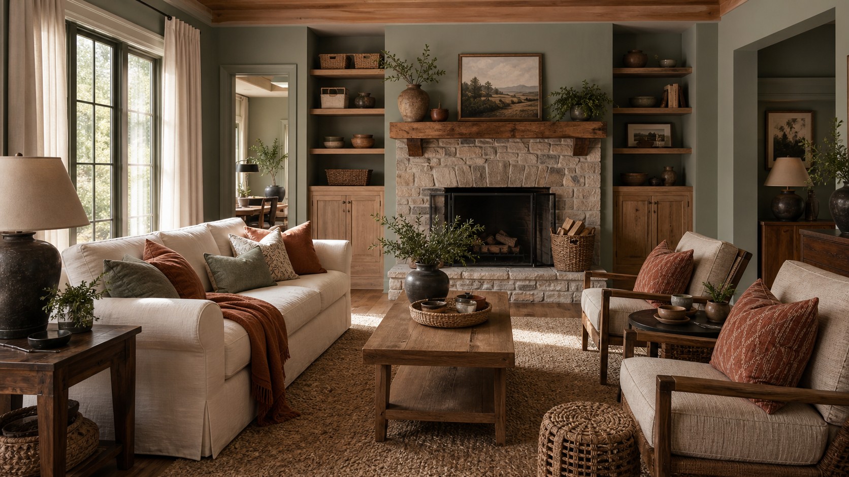
Warm white, sage, oak, and charcoal
Sage remains relevant because it behaves almost like a neutral while recalling landscape and garden. Paired with warm white and oak, it creates a light, restorative room. Charcoal prevents the combination from becoming overly pale or rustic. This scheme works well with abundant natural light and in rooms that connect visually to outdoor greenery. It can feel traditional, contemporary, or transitional depending on furniture shape.
Let sage vary slightly across paint, fabric, and ceramics. Exact matching can look artificial, while neighboring gray-green tones create depth. Oak should show natural grain and a warm but not strongly orange finish. Use charcoal in narrow frames, fireplace details, lighting, or a subtle rug pattern. For seasonal changes, muted blue, burgundy, or terracotta can join the palette in small amounts.
Cream, chocolate, rust, and linen
Brown-based palettes cycle through fashion, but their connection to wood, earth, leather, and natural fibers gives them lasting relevance. Cream and undyed linen lift chocolate brown, while rust adds a warm color note without leaving the earthy family. This scheme is especially effective in rooms with dark floors, exposed beams, brick, or substantial wood furniture. It creates a grounded atmosphere that improves in evening light.
Avoid buying every upholstered piece in brown. Distribute the color through wood, leather, a rug, and smaller textiles, using cream on the largest soft surface for contrast. Rust may appear in a patterned chair, artwork, or pillows. Include a little blackened metal or deep olive if the palette needs definition. Varied materials are essential; a room of smooth brown surfaces will feel dated more quickly than one combining wool, linen, grain, and patina.
Soft blue, white, tan, and red accents
Blue and white have centuries of decorative history, but tan and restrained red make the pairing more relaxed for a living room. Choose softened blue rather than a clear pastel, and use warm white instead of a sharp gallery white. Tan can come from seagrass, leather, wood, or a woven rug. Red should be the smallest note: a faded stripe, a book spine, a ceramic detail, or part of an artwork.
This scheme can drift toward a theme if motifs are repeated too literally. Limit overt coastal, patriotic, or country references and focus on color relationships. Mix an abstract blue artwork with a classic striped pillow, or place a traditional blue-and-white ceramic beside a modern lamp. The cross-period combination keeps familiar colors feeling collected. Deep brown or navy can be added where the room needs more visual weight.
Taupe, black, cream, and natural wood
A monochromatic neutral room becomes timeless when black and wood provide structure. Taupe bridges warm and cool undertones, cream creates light, and black sharpens silhouettes. Natural wood prevents the scheme from feeling corporate or overly graphic. This combination supports changing accent colors particularly well. Olive, burgundy, blue, or ochre can be introduced for a season and removed without rebuilding the room.
Black should trace the composition rather than cover it. Use it in a slender lamp, picture frame, table base, or fireplace surround. If black occupies a large surface, soften it with visible texture and warm light. Taupe can shift from pale putty to mushroom across upholstery and rugs. Keep cream away from pure white comparisons, and ensure wood appears more than once so it feels integral rather than incidental.
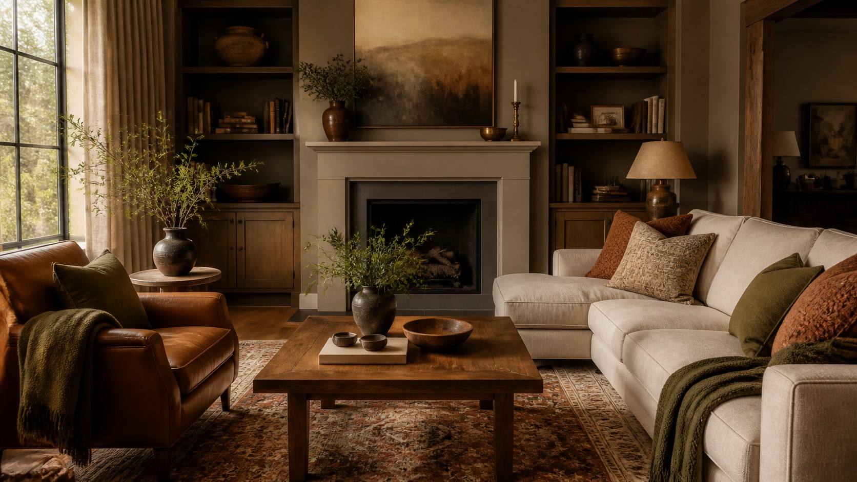
Olive, cognac, parchment, and bronze
Olive and cognac create a mature, club-like warmth, while parchment keeps the room from becoming dark. Bronze connects the green and brown with a subdued metallic note. This palette suits libraries, family rooms, and living spaces that receive filtered light. It can be used lightly, with parchment walls and olive pillows, or more dramatically, with olive walls and cognac leather seating.
Balance is important because both olive and cognac have strong personalities. If one covers a large area, keep the other more contained. Add woven wool, linen, and aged wood to prevent the palette from looking glossy or themed. Cream can substitute for parchment where more brightness is needed. A restrained touch of dusty rose or muted blue in artwork can add freshness while respecting the earthy base.
Greige, deep teal, ivory, and medium oak
Deep teal has the stability of blue and the natural association of green. In a grayed version, it can serve as a long-term accent or a dramatic background. Greige and ivory create a quiet field, while medium oak adds warmth. This scheme is useful in open-plan homes because teal can define the living zone without requiring a bright color that competes with adjacent rooms.
Use teal in broad, coherent blocks: built-ins, a pair of chairs, or a large rug detail. Avoid scattering it through many unrelated accessories. Greige should be selected beside the oak so neither turns unexpectedly pink or green. Ivory textiles provide softness, and a small dark bronze or charcoal element can outline the palette. If teal later feels too prominent, reducing accessories will allow the neutral foundation to remain intact.
Stone, burgundy, blush, and dark oak
Red-based schemes can last when the reds are softened by brown and gray. Burgundy carries historical depth, blush provides a lighter echo, stone calms both, and dark oak grounds the room. This palette works beautifully with traditional art, patterned rugs, and tailored contemporary furniture. It feels warm in winter yet can be lightened with linen and pale ceramics during warmer months.
Use blush as a nuanced neutral rather than a sugary pink. Look for versions with beige, clay, or gray undertones. Burgundy can appear in one significant textile or several small areas within a rug. Dark oak should not overwhelm the room; separate large wood pieces with lighter fabric and wall color. A little aged brass adds luminosity, while charcoal can make the scheme feel more modern.
Why black and white need a middle tone
Black and white are often called timeless, but used alone they can feel severe in a room meant for relaxation. Introduce a middle tone such as camel, oak, taupe, or olive. It reduces visual strain and gives the high-contrast edges somewhere to transition. Off-black and warm white are also easier to live with than their pure equivalents. Their softened character responds better to changing daylight.
Texture is particularly important in a limited palette. White boucle, blackened steel, honed stone, and open-grain wood each reflect light differently. Use black where it clarifies shape and white where it expands space. Let the middle tone occupy enough area to be noticed, perhaps through a rug, leather chair, or curtains. The resulting scheme remains graphic but feels human and layered.
Coordinate rooms without repeating them
When a living room opens to a dining room, kitchen, or hall, continuity matters. Carry one neutral and one material across the spaces, then vary the accent color. Warm white walls and walnut details might continue throughout, while the living room uses navy and the dining room uses olive. This approach creates a related sequence without turning the entire floor into one repeated scheme.
Consider sightlines from each doorway. A strong color should have a small answering note in the next room, even if it is only artwork or upholstery detail. Flooring already provides significant continuity, so avoid forcing every fabric to coordinate. Rooms can have distinct moods when undertones and material temperatures agree. The transition should feel intentional, not identical.
Use pattern to preserve flexibility
A patterned rug or textile can hold several colors together and make later updates easier. Choose patterns with a clear dominant background and softened secondary hues. Traditional motifs have long staying power, but geometrics, stripes, and organic abstractions can also endure when their contrast is moderate. The pattern should connect the furniture rather than dictate exact matches for every accessory.
Spread pattern across different scales. A large rug motif can pair with a fine stripe and one medium botanical. Leave ample solids between them. If you tire of an accent color, a complex rug may still work because no single secondary hue dominates. This is one reason faded, multicolor patterns are so useful in living rooms: they allow the scheme to evolve without making the floor look unrelated.
Protect longevity through placement
Color lasts longer when the boldest hues appear on surfaces that are reasonable to change. Walls, pillows, and occasional chairs are generally easier to update than a large sectional or custom cabinetry. That does not mean every expensive item must be beige. If deep green or navy has been a consistent personal favorite, using it on a major piece may be entirely sensible. Longevity is partly personal history, not only market consensus.
Before committing, consider fading, maintenance, and adjacent finishes. Strong sunlight can alter natural textiles, while pale upholstery may require cleanable fabric. Dark paint reveals some wall imperfections and hides others. Practical performance affects whether a color continues to feel appealing after years of use. A scheme that looks beautiful but creates constant worry will not feel timeless in daily life.
Refresh without replacing the foundation
When a lasting scheme begins to feel stale, adjust contrast and texture before changing every color. A darker lampshade, lighter rug, warmer wood table, or new curtain fabric may restore balance. Remove accents that have multiplied over time and reintroduce the core colors in clearer proportions. Often the original palette remains sound; the room has simply lost its hierarchy.
The best living room color schemes endure because they are nuanced, connected to natural materials, and responsive to the home. Ivory and navy, sage and oak, cream and chocolate, or taupe and black can each remain relevant when proportion and undertone are handled carefully. Choose colors you have returned to across years, give them distinct roles, and leave room for small changes. Timeless color is not motionless. It is a stable composition capable of graceful revision.