Cozy family room color is not limited to tan walls and brown furniture. A room feels inviting when its colors reduce harsh contrast, flatter the available light, and appear through materials people want to touch. Cream can feel cold beside the wrong gray, while deep blue can feel remarkably warm when paired with walnut, camel, and amber light. The best palette begins with the emotional effect you want and the fixed surfaces already in the room. From there, layered tones, a grounding dark note, and a small amount of livelier color can create immediate comfort without making the space heavy or dim.
A: Warm neutrals, earthy greens, soft browns, clay, camel, and deep blue are all cozy choices.
A: Yes, but warmer greige, mushroom, and taupe shades feel more current than cool gray.
A: Add wood, warm lighting, woven textures, soft rugs, and cream instead of stark white.
A: Light colors feel airy; darker colors feel intimate. The best choice depends on room size and light.
A: Cream, sage, dusty blue, terracotta, taupe, olive, and warm white pair beautifully with brown.
A: Rust, ochre, camel, burgundy, olive, and brass accents add instant warmth.
A: Yes. Pair navy with warm white, cognac leather, wood, and soft lighting.
A: Try patterned rugs with beige, rust, brown, blue, olive, or charcoal for depth.
A: Three main colors usually work best: one base, one secondary shade, and one accent.
A: Warm white, greige, taupe, natural wood, and soft black accents feel timeless and buyer-friendly.
What makes a color palette feel cozy
Warmth is partly a matter of undertone, but coziness also depends on value, contrast, and repetition. Colors with red, yellow, or earthy undertones often feel warm, yet a cool hue can become inviting when it is softened and surrounded by tactile materials. Medium values are especially useful because they reduce the jump between pale walls and dark furniture. A family room built from cream, camel, olive, and walnut has gradual transitions that feel restful.
Repetition makes color feel enveloping. If an accent appears only once, it may look accidental and draw too much attention. Repeat it in at least two additional places at different scales. An olive chair might relate to a small stripe in the rug and a ceramic vase. The colors do not need to match precisely. Slight variation creates depth, as long as the undertones remain compatible. This layered effect is more comfortable than a rigid set of identical swatches.
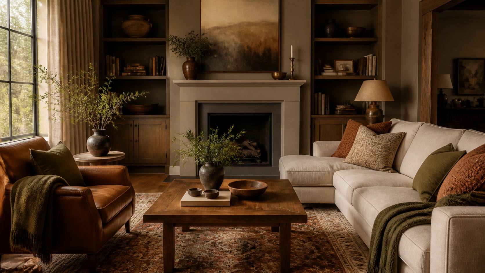
Warm cream, camel, walnut, and charcoal
This palette is a dependable choice for rooms that need brightness and warmth. Use warm cream on walls or large upholstery, then bring in camel through leather, velvet, or woven textiles. Walnut gives the room depth and a natural mid-to-dark tone. Charcoal defines smaller edges in frames, lamps, or a rug pattern. Because the palette spans light, medium, and dark values, it remains clear without feeling stark.
Texture prevents the neutrals from becoming generic. Pair a matte wall with soft boucle, smooth leather, open-grain wood, and a heathered wool rug. Keep bright white to a minimum unless it appears in small highlights; it can make warm cream look yellow by comparison. For accent color, muted burgundy, forest green, or smoky blue can all work. Introduce only one if the goal is a quiet, cocooning room.
Oatmeal, olive, clay, and aged brass
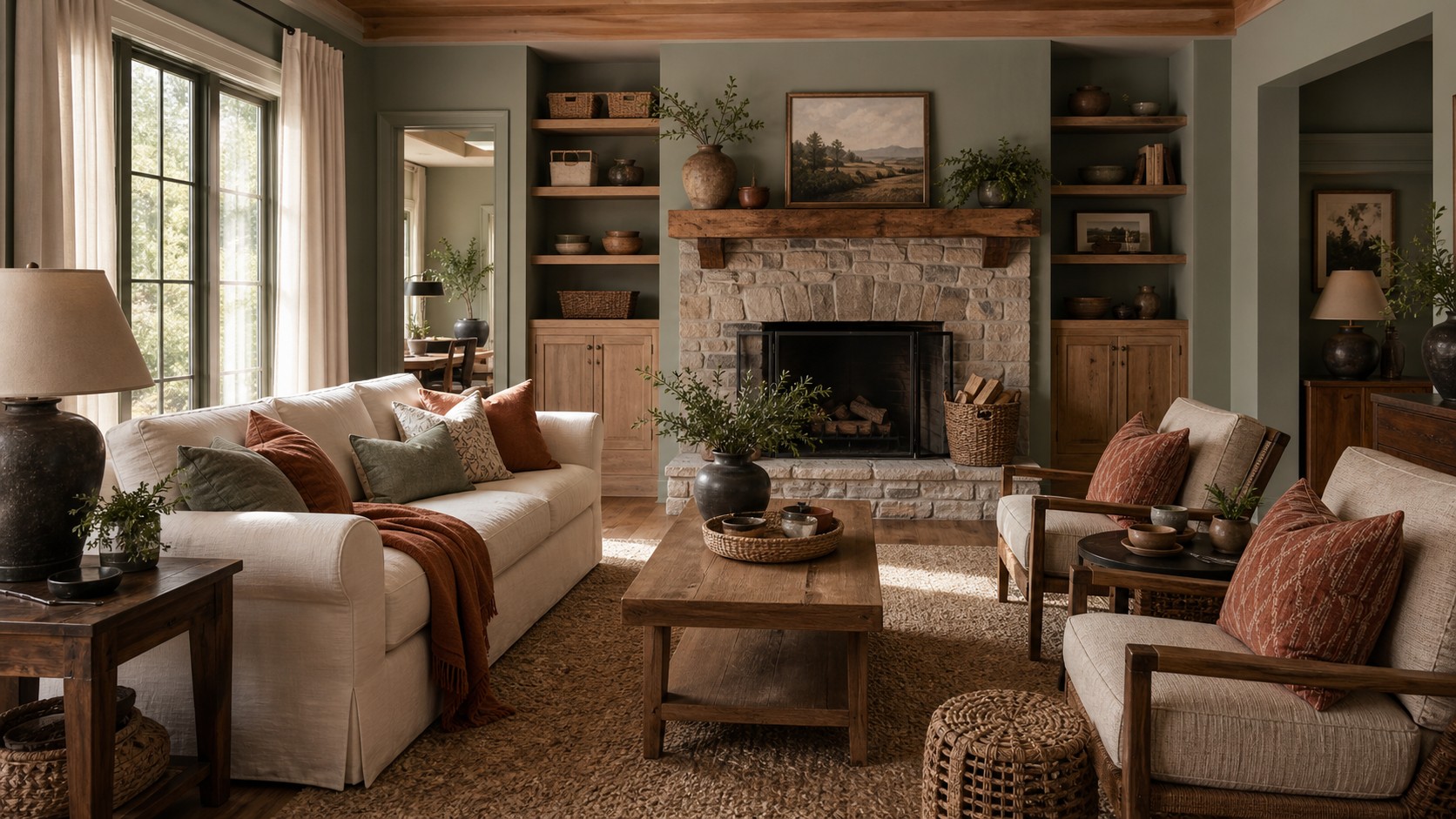
Earth colors create comfort because they echo materials found outdoors. Oatmeal provides a calm foundation, olive brings botanical depth, and clay adds a gentle red-orange warmth. Aged brass contributes a low glow without behaving like another strong color. This combination suits rooms with medium or warm wood floors and works particularly well in homes that receive soft northern or eastern light.
Control the ratio so olive and clay do not compete. Let oatmeal occupy the largest area, use olive on one substantial element such as chairs or curtains, and reserve clay for pillows, artwork, or a small ottoman. Add brown through wood and baskets. Plants can reinforce olive naturally, but vary their leaf shapes and avoid relying on greenery as the only color source. A faded rug containing all three hues will make the palette feel established.
Mushroom, dusty blue, cream, and cognac
Dusty blue can feel cozy rather than coastal when it includes enough gray and is paired with warm brown. Mushroom walls or upholstery create a complex neutral bridge between the cool blue and cognac leather. Cream keeps the room light. This palette is soothing for a busy household because it offers color without high saturation. It also transitions gracefully between daylight and warm evening lamps.
Use cognac strategically. One leather chair, an ottoman, or wood with orange-brown undertones may be sufficient. Too much can shift the room toward a themed look. Dusty blue works beautifully in washable pillow covers, drapery, or a subtly patterned rug. Add a small amount of charcoal or deep navy to sharpen the edges. The darkest note keeps pale blue and cream from appearing overly sweet.
Soft taupe, burgundy, blush, and espresso
Burgundy has returned to interiors because its brown undertone makes it easier to live with than a bright red. Combine it with soft taupe, muted blush, and espresso for a palette that feels layered and intimate. Taupe should cover the broadest surfaces. Burgundy can anchor a chair, patterned rug, or large artwork, while blush softens the transition to light neutrals. Espresso wood or metal adds definition.
This scheme benefits from plush but matte materials: wool, washed velvet, brushed cotton, and dark wood. Avoid too many glossy red surfaces, which can make the color feel formal. In a small room, use burgundy on accessories and let espresso appear in narrow lines. In a larger room with strong light, a deep burgundy sectional or built-in cabinet can create a dramatic yet welcoming focal point.
Warm white, sage, sand, and terracotta
For an airy interpretation of cozy, combine warm white with sage, sand, and terracotta. The palette feels sunlit and relaxed but retains enough earthiness to avoid sterility. Warm white can cover walls and curtains, sand works on upholstery and rugs, sage introduces calm color, and terracotta provides the necessary spark. Pale oak, rattan, and light natural fibers fit easily within the scheme.
The key is choosing softened versions of each hue. Clear mint and bright orange will make the room feel more energetic than restful. Look instead for sage with gray or brown undertones and terracotta that resembles weathered clay. Ground the room with a little deep brown or bronze. Even a light palette needs shadows, especially in the evening, when dark details help lamplight feel warmer.
Deep navy, tobacco, parchment, and rust
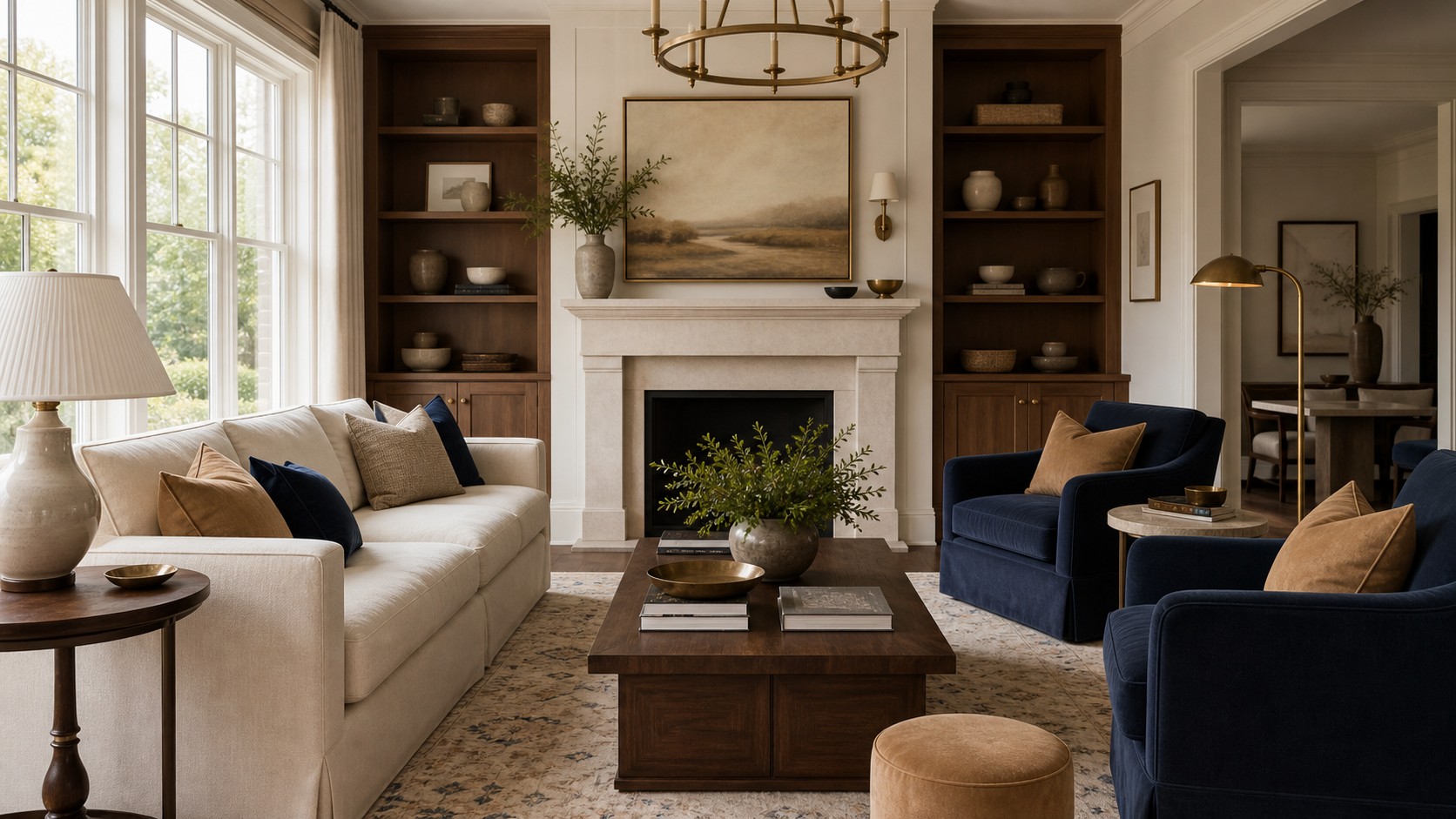
Dark color can make a family room feel sheltered. Navy walls or cabinetry create an enveloping background, while tobacco leather, parchment upholstery, and rust textiles bring warmth forward. This palette is especially effective in rooms used mostly at night or spaces with abundant windows that can handle a deeper wall color. The contrast is stronger, but every color has enough complexity to remain comfortable.
Test navy carefully because some versions turn bright blue in daylight or nearly black at night. A slightly grayed navy is usually more adaptable. Use parchment rather than pure white to soften contrast, and repeat tobacco or rust near eye level so the room does not feel top-heavy. Warm metal, woven shades, and medium wood can further connect the dark walls to lighter seating.
Chocolate, caramel, ivory, and moss
Brown is an exceptionally cozy foundation when it is treated as a family of tones rather than a single finish. Chocolate grounds the room, caramel adds warmth, ivory opens it, and moss introduces a quiet natural color. This palette works with many existing wood floors and can make a large family room feel more intimate. It also tolerates everyday wear better than an all-pale scheme.
Distribute browns through different materials so the room does not resemble a matching furniture set. Chocolate might appear in stained cabinetry, caramel in leather, and medium brown in a woven rug. Ivory should provide real relief through walls, curtains, or a sofa. Moss can sit on chairs or pillows and may lean more yellow or gray depending on the wood undertone. Add black only in small amounts, since chocolate already performs the grounding role.
Greige, muted teal, tan, and blackened bronze
Muted teal offers a richer alternative to blue or green while remaining calming. With greige, tan, and blackened bronze, it creates a cozy palette with a slightly tailored character. Greige works best when it relates to both the floor and upholstery. Tan brings warmth through leather or woven textiles, and bronze establishes crisp boundaries without the severity of pure black.
Use teal on a generous but contained surface, such as a pair of chairs, a media cabinet, or drapery. Scattering many tiny teal objects can feel busy. A rug that combines greige and faded teal will integrate the color, while tan pillows or a leather ottoman keep it from reading cool. Under warm lighting, bronze and teal create depth that feels sophisticated as well as comfortable.
Adjust the palette for natural light
North-facing rooms tend to receive cool, consistent light. Warm neutrals, clay, olive, and soft yellow-browns can counter that coolness, but overly pale warm paint may turn dingy. Choose colors with enough depth to hold their identity. South-facing rooms can support cooler blues and greens because abundant warm light softens them. East-facing rooms glow in the morning and cool later, while west-facing rooms intensify warm color late in the day.
Observe the room at the hours when it is used most. A sample that looks ideal at noon may become flat during evening television time. Paint large movable boards and place them near the floor, upholstery, fireplace, and windows. Test fabrics in the same way. Color is relational; wall paint can shift when a new rug covers much of the floor or when curtains filter the daylight.
Use the 60-30-10 idea flexibly
The familiar 60-30-10 guideline assigns most of the room to a dominant color, a smaller share to a secondary color, and a final accent to the smallest portion. It is useful as a diagnostic tool, not a strict calculation. In a cozy room, the dominant category may include several related creams rather than one exact shade. The secondary category might combine wood and camel because they perform a similar visual role.
If a room feels chaotic, identify which color is supposed to lead and reduce isolated accents. If it feels flat, strengthen the secondary or dark note. Some palettes benefit from a 70-20-10 balance, while tonal rooms may use many small variations of one family. What matters is hierarchy. The eye should sense a background, a supporting layer, and a few moments of emphasis.
Let texture carry part of the color
The same color changes character across materials. Olive velvet absorbs light and appears deep; olive linen looks dry and casual; glazed olive ceramic reflects small highlights. Using one hue through varied textures creates complexity without expanding the palette. This is especially helpful in neutral rooms, where texture can provide the variation that brighter color would otherwise supply.
Texture also alters perceived warmth. A cool gray in wool may feel cozier than a warm beige in a slick finish. Prioritize materials associated with softness and nature: brushed fabric, nubby weave, matte pottery, wood grain, woven fiber, and honed stone. Balance them with a few smooth surfaces so the room remains practical and does not become visually fuzzy. Contrast of texture makes every color more legible.
Create evening warmth with lighting
No cozy palette survives harsh, inconsistent lighting. Use warm bulbs with strong color rendering so reds, woods, and skin tones remain natural. Place light at several heights through table lamps, floor lamps, sconces, and a dimmable overhead fixture. Shades made from linen, paper, or pleated fabric diffuse light and add their own warm color. Avoid relying exclusively on cool recessed lighting.
Consider how lamps interact with wall color. A shaded lamp near deep paint creates a concentrated glow, while light walls bounce illumination more broadly. In a dark palette, add enough sources to reveal corners and pathways. In a pale room, lower output may be sufficient. Candles can add atmosphere, but the everyday lighting plan should create comfort without them. The room should feel welcoming on an ordinary winter evening, not only when styled for a photograph.
Test before committing
Collect samples for every major surface and view them together. A paint chip alone cannot reveal whether the wall will flatter the sofa, rug, wood floor, and stone fireplace. Build a portable palette with painted boards, fabric swatches, rug samples, and finish pieces. Remove anything that appears unexpectedly pink, green, yellow, or blue beside the fixed elements. Undertone conflicts are easier to correct before orders are placed.
Live with the strongest candidates for several days. Move them around the room and photograph them in different light. Once the foundation is right, add accent colors gradually. A cozy family room should feel layered, not overloaded. Whether you choose warm cream and camel or navy and rust, the winning palette will support the room’s light, repeat with intention, and appear through materials that invite people to settle in.