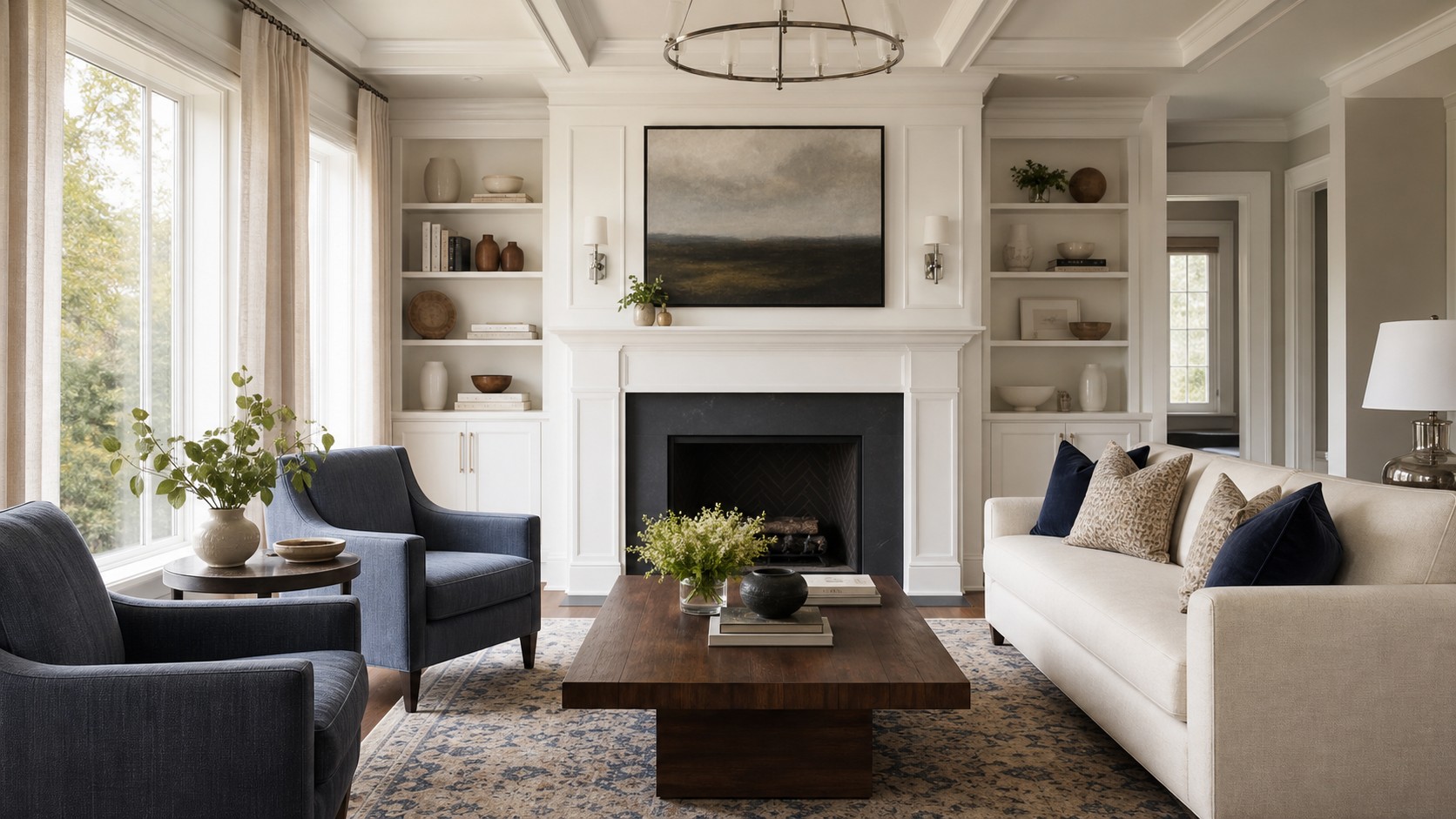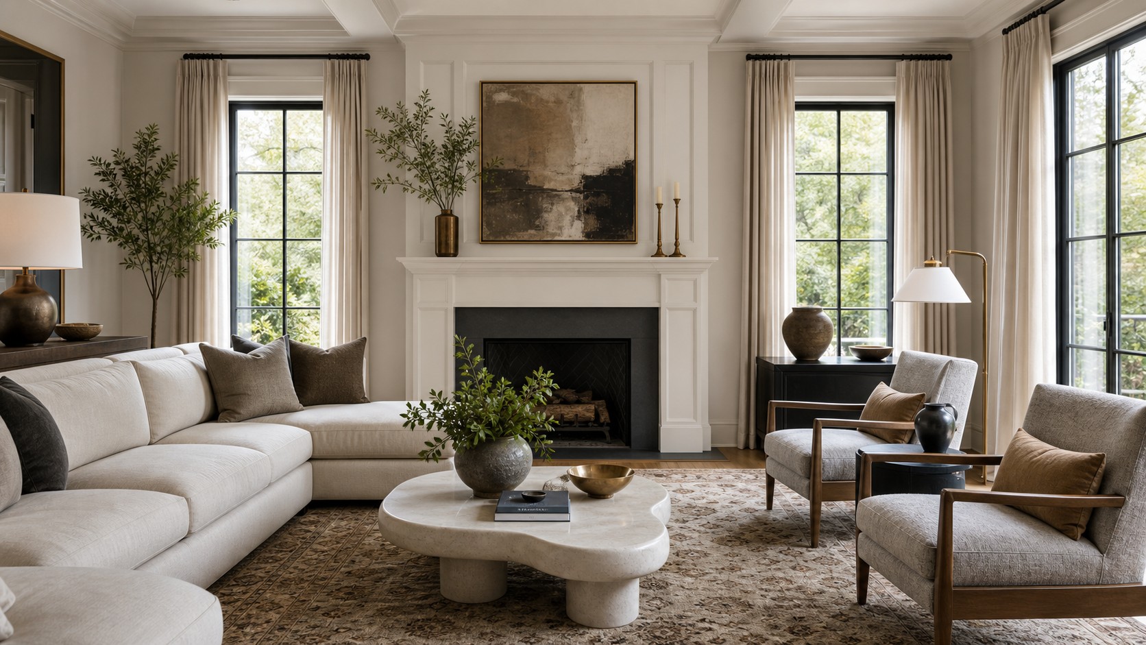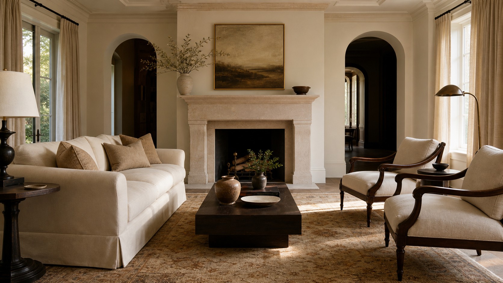
A sophisticated family room is not defined by fragile furniture or expensive finishes displayed at a distance. Its refinement comes from clarity: each piece has an appropriate scale, materials repeat with purpose, and practical needs are resolved without visual clutter. Comfort remains central, but it is expressed through supportive upholstery, warm light, tactile textiles, and a layout that encourages conversation. This kind of room feels composed rather than decorated. By investing in a few strong foundations and editing the rest, you can create an interior that carries a sense of occasion while still welcoming bare feet, weekend movies, homework, and unplanned guests.
A: Warm neutrals, soft grays, taupes, creams, navy, olive, camel, and muted earth tones tend to age well.
A: Use plush seating, layered lighting, durable fabrics, refined finishes, and plenty of hidden storage.
A: It can be included, but balance it with art, built-ins, a fireplace, or a beautiful media console.
A: Invest in the sofa, rug, lighting, and main storage pieces because they shape the room’s comfort and style.
A: Enough to add softness and color, but not so many that seating becomes inconvenient.
A: Yes. Deep navy, charcoal, brown, and green can feel elegant when balanced with warm lighting and lighter textiles.
A: Avoid overly trendy finishes, choose classic shapes, and update smaller accessories instead of major furniture.
A: Choose a rug large enough for at least the front legs of the sofa and chairs to sit on it.
A: Use fewer larger pieces, tall curtains, mirrors, light-reflecting surfaces, and a tight color palette.
A: Built-ins, layered lighting, tailored window treatments, quality hardware, and thoughtful furniture placement create a custom look.
Define sophistication through proportion
Proportion is the quiet discipline behind elegant rooms. A sofa should relate to the length and height of its wall, a coffee table should bridge the seating without crowding it, and lamps should have enough presence to balance nearby furniture. Before purchasing anything, record wall lengths, window heights, door swings, and circulation paths. Add the dimensions of pieces already staying. A simple scaled plan prevents the common mistake of choosing items individually and discovering that they compete when placed together.
Pay particular attention to vertical relationships. Low furniture can make a tall room feel empty, while overly high case pieces may compress a room with modest ceilings. Artwork, drapery, and lighting help connect these zones. Mount curtains closer to the ceiling, choose artwork substantial enough for the wall, and vary lamp heights across the room. Sophistication often appears when the eye moves smoothly from floor to ceiling without encountering abrupt gaps or a cluster of objects all ending at the same level.
Establish an architectural point of view
Even a plain room benefits from one clear architectural idea. Existing fireplaces, built-ins, beams, or windows may already provide it. Emphasize the strongest feature instead of introducing several competing statements. A fireplace can gain presence through a full-height plaster surround, quiet stone, or restrained molding. Built-ins look more intentional when their depth and trim align with nearby openings. If the room lacks a focal feature, a large artwork, handsome media cabinet, or long wall of drapery can establish order without false ornament.
Added millwork should relate to the home’s character. Simple picture-frame molding can give broad walls dimension, but its spacing must reflect doors, windows, and furniture. Avoid applying decorative panels merely to fill space. Paint trim and walls in neighboring tones for a subtle effect, or use one continuous color to emphasize shadow rather than contrast. Architectural details feel lasting when they appear integral to the room, not attached after every furnishing decision has been made.
Compose a restrained tonal palette
Sophisticated rooms often use fewer colors than casual rooms, but they create greater variation within each color family. A palette of ivory, camel, walnut, and charcoal can feel richer than a collection of unrelated accent colors. Choose one light foundation, one grounding midtone, and one dark note. Then repeat each at different scales. Pale walls and upholstery may dominate, wood and leather provide the middle range, and blackened metal or deep brown defines edges.
Contrast is essential. Without it, a neutral room can appear washed out in daylight and flat at night. A dark console beneath pale artwork, espresso legs against a light rug, or a charcoal pillow on a cream sofa gives the eye a place to rest. Keep the darkest tone controlled rather than scattered in tiny fragments. Two or three confident uses feel more intentional than numerous small black accessories. The goal is not drama for its own sake, but enough definition to make softer materials look luminous.
Select fewer, better furniture pieces
An elevated family room does not need furniture on every wall. Start with the pieces that directly serve people: generous seating, a table for each seat, and storage for recurring activities. Choose silhouettes that are distinct but compatible. A long tailored sofa might sit with curved lounge chairs and a substantial rectangular cocktail table. The variation creates interest, while shared proportions and repeated materials hold the composition together. Every item should earn its footprint through comfort, function, or visual contribution.
Construction matters because sophisticated design invites close attention. Look for aligned seams, well-filled cushions, stable joinery, smoothly operating drawers, and finished backs where furniture will float in the room. Vintage pieces can add exceptional craftsmanship at a reasonable scale, especially side tables, chests, and occasional chairs. Combining one or two older pieces with clean new upholstery prevents the interior from feeling like a catalog. The slight irregularity of age adds authority and a sense that the room has a past.
Make comfort look tailored
Comfort and polish are not opposites. The distinction lies in how softness is contained. Deep cushions can look composed when welting is crisp, fabric is properly fitted, and pillow inserts fill their covers. A chaise or ottoman can support lounging without dominating the plan if its dimensions align with the seating group. Swivel chairs are particularly useful in rooms serving both conversation and television viewing, allowing function to shift without rearranging heavy furniture.
Choose upholstery fabrics that reward touch. Brushed linen blends, soft boucles, fine herringbones, matte velvets, and supple leather create quiet sensory richness. Keep heavily textured fabric to one or two pieces so the room does not become visually busy. Practicality remains important; many high-performance textiles now offer a refined hand. Order large samples and view them vertically and horizontally throughout the day. Color, sheen, and texture can change dramatically under the room’s actual light.
Use stone, metal, and wood as a material hierarchy
Rather than distributing every finish equally, establish a hierarchy. Wood may be the dominant material through flooring, tables, and cabinetry. Stone can provide a cooler, weightier note at the fireplace or a side table. Metal then appears sparingly in lighting, hardware, and a slim furniture frame. This hierarchy creates coherence while preserving variety. It also keeps luxurious materials from feeling ostentatious, because each is used where its natural qualities support the room.
Finish influences mood. Honed stone feels quieter than highly polished slabs, and satin metal is generally softer than mirror-bright chrome. Open-grain wood adds warmth and evidence of craft. Repeat a finish at least once, but avoid exact uniformity. Warm brass lamp details can relate to bronze cabinet hardware without matching perfectly. Walnut furniture can coexist with oak floors when a rug separates them and both tones reappear elsewhere. Sophistication depends on relationships, not rigid finish rules.
Treat lighting as part of the composition
Lighting fixtures remain visible even when switched off, so consider them furniture for the walls and ceiling. A central pendant should suit the room’s volume and leave clear sightlines. Table lamps can add symmetry around a sofa, while a sculptural floor lamp introduces movement near a chair. Sconces are valuable where surface space is limited. Choose fixtures with decisive shapes and restrained details, then repeat a metal or shade color to connect them.
At night, separate circuits and dimmers create layers. General light supports cleaning and active gatherings; lower lamps soften the room for conversation; accent lights reveal artwork or shelving. Aim light toward materials worth seeing rather than illuminating every corner equally. A gentle pool across stone, a warm wash on drapery, or a focused picture light adds depth. Consistent warm bulbs prevent the patchy effect caused by mixing cool and warm sources in the same field of view.
Choose art with confidence and breathing room
Art can set the emotional register of a sophisticated family room. Choose work because its color, subject, or form continues to hold attention, not because it perfectly matches a pillow. One large piece often carries more authority than a collection of undersized frames. Its width should relate to the furniture below, and its center should be comfortable to view from a seated position. Substantial framing and generous matting can give smaller works enough presence.
A gallery wall can also feel refined when it follows a clear logic. Repeat frame materials, maintain consistent spacing, or organize varied works around a strong horizontal line. Include original art, photography, textiles, and personal pieces rather than generic prints chosen solely to fill rectangles. Leave adjacent walls quieter so the display has room to register. Thoughtful art brings individuality to a neutral interior and ensures elegance does not slide into anonymity.
Control pattern with scale and placement
Pattern creates movement, but sophisticated rooms usually concentrate it. Select one primary pattern, perhaps a rug, chair fabric, or curtain, then support it with smaller or quieter designs. A broad geometric rug can coexist with a fine herringbone pillow and a subtle stripe because their scales differ. Repeating motifs of equal size creates competition. Solids and natural textures should occupy enough area to let each pattern remain legible.
Classic patterns can feel contemporary when recolored or enlarged. Checks in taupe and cream, abstract botanicals in charcoal, and softened stripes offer familiarity without nostalgia. Use bolder pattern on items with simple forms; ornate shapes and complex fabric can overwhelm one another. If the family room opens to other spaces, carry a minor color from the pattern into the adjoining rooms. That small repetition creates continuity without duplicating the entire scheme.
Integrate storage into the visual rhythm
Clutter is less noticeable when every recurring item has a logical home. Closed cabinetry can hold games, devices, toys, and extra throws, while open shelves display a controlled selection of books and objects. Divide storage according to frequency of use. Everyday items belong in easy drawers and baskets; occasional pieces can sit higher or farther away. Avoid designing storage so precisely around current technology that it becomes obsolete when devices change.
Cabinetry should reinforce the room’s architecture. Align door divisions with shelves, repeat nearby trim details, and choose hardware proportional to the fronts. Freestanding storage can be equally effective. A long credenza offers visual weight beneath a television, while an antique chest adds character beside a sofa. Interior organizers are worth the effort because they allow calm surfaces without making objects difficult to retrieve. An elegant room remains livable only when tidiness is convenient.
Style with shape, not quantity
Surface styling becomes more sophisticated when objects are chosen for silhouette and material. On a broad coffee table, combine a low tray, a tall organic form, and a stack of books. The differences in height create a composition without requiring many items. On shelves, place rounded ceramics near angular frames and alternate dense arrangements with open space. Repeating one color or material across several groupings gives the eye a subtle path through the room.
Scale accessories to their setting. A tiny bowl can disappear on a large table, while a collection of small objects may read as clutter from across the room. Use fewer, larger pieces in prominent locations, then reserve intimate details for places viewed up close. Fresh branches, flowers, or a plant introduce irregularity and life. Even practical objects can contribute: a beautiful box can hide chargers, and a substantial tray can make everyday necessities appear orderly.
Preserve ease in an elevated room
True sophistication includes permission to use the room. Choose finishes that can be maintained, provide coasters where they are needed, and keep soft throws accessible rather than folded beyond reach. A pale sofa is practical when its fabric is cleanable and cushions can be rotated. Stone tables may require sealing; wood benefits from appropriate protection. Understanding care before purchase prevents anxiety and helps materials age attractively rather than being treated as untouchable.
Consider the room at its most active. Where will an extra guest sit, a child spread out a game, or a pet settle? A pair of upholstered stools can move between a console and the coffee table. A large ottoman may serve as a footrest, play surface, and extra seat. These adaptable pieces protect the room’s composure by giving changing activities a place. Elegance feels convincing when it anticipates life instead of resisting it.
Edit until every choice feels deliberate
The final stage is subtraction. Remove temporary purchases that no longer serve the plan, consolidate scattered accessories, and correct pieces whose scale interrupts the room. Photographing the space can reveal imbalance that is difficult to notice in person. Look for repeated heights, isolated colors, blocked pathways, and surfaces with no quiet area. Editing does not mean stripping away personality. It means allowing the strongest architecture, furniture, art, and personal objects to carry the room.
A sophisticated family room grows from sound proportions, a controlled palette, tactile materials, and thoughtful function. It does not need to announce its quality. The finish of a drawer, the fall of a curtain, the comfort of a chair, and the glow of a lamp communicate refinement more persuasively than conspicuous labels or delicate display pieces. When beauty and use are resolved together, the room feels calm, generous, and lasting, which is the most meaningful form of luxury at home.